A website popup is an alert box that is triggered to appear on your website. Its purpose is to provide the visitor with an important call-to-action and hopefully a reason to provide you with their contact details so you can add them to your marketing database.
Alternatively referred to as lightboxes or opt-in boxes – website popups have received a bad rap over the years, typically due to ‘entry popups’ that immediately pop up when you enter an e-commerce store.
However, popups are an interesting design and marketing element. Although they do temporarily disrupt the user experience (usually a big no-no), visitors typically don’t mind taking a minute to consider the popup if they are designed well and offer something exciting or enticing.
In this case, we are referring to conversion optimising popups where their primary function is to collect email address to push visitors through the sales funnel via email. Sumo conducted a study of nearly two billion popups and found that the average popup conversion rate is 3.09% with some conversion rates as high as 50.2%!
Although 3.09% might seem like a small number…
If 100,000 visitors are coming to your site, that equals 3,000 subscribers!
So while people might think popups don’t work or are ineffective, it’s merely a common misunderstanding between successful pop-ups and unsuccessful ones (ones that are annoying and frustrating to visitors). When used intelligently, e-commerce stores can help turn their website visitors into conversions and grab their visitor’s attention at the right time. You can use popups to deliver timely and relevant request and notifications. So by using visitor data, you can nurture and guide them through the sales funnel.
By securing visitors emails through popups, you have now turned them in leads and can communicate with consumers via email and prompt them further down the sales funnel.
This article will focus on best practices for good pop up design which is a critical aspect of the conversion process.
The Offer
Before forming your popup, you’ll want to create an offer or incentive that will encourage people to convert on your form and subscribe to your email list. It’s usually the determining factor whether or not a visitor converts. Often the most popular offers are:
- First-time discounts of 10-20% off
- Contest entry to win
- Free shipping
- A gift with purchase
- Content (Newsletters, how-to-guides, weekly articles, etc.)
- Sale items.
Keep in mind, the success of these popups will depend on your target audience and product. It’s best to A/B test your product offers to identify which one converts best for your e-commerce store.
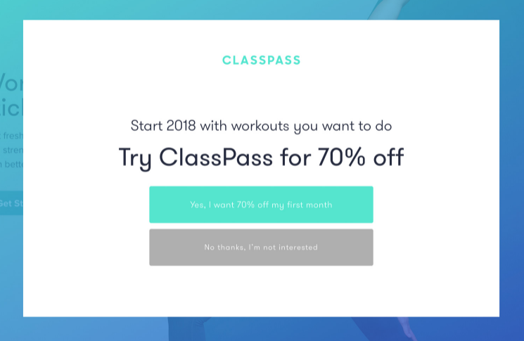
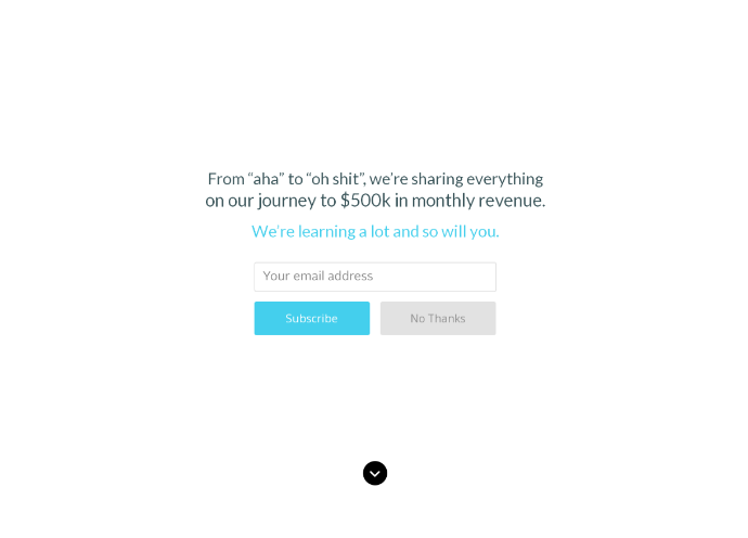
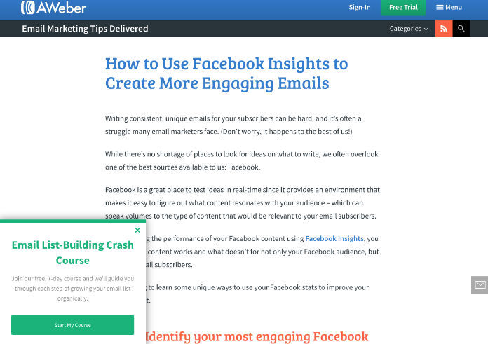
Here are some great pop up offer examples from e-commerce stores:

(Image via ClassPass)

(Image via GrooveHQ)

(Image via AWeber)
A Beginners Guide: Best Practices for Popups
Create a clear and single call to action.
You are effectively interrupting your visitor’s browsing search when the popup comes up. Don’t overwhelm your visitor with too much information on your pop up. Focus on one goal with a clear and simplistic call to action.
Less is more
Your popup should both blend in with the page it pops up on, but it should also stand out and catch your visitors’ attention. You should use bold colours that fit in with the design of your site, simple and clear text and only one main image. If there is too much happening within the popup, it can reduce conversions.
This should also be applied to the information you are asking visitors. In most cases, an email and a first name are enough to increase conversions.
Trigger your pop up at the right time
Timing is incredibly essential for popups. If you time it too early, it can annoy users, and if you time it too late, you miss out on a conversion opportunity. The best way to figure out the timing for your audience is to A/B test which will help you work towards your goal and engage more visitors who visit your site.
Capture existing website visitors
Unfortunately for e-commerce sites, 70% of visitors who abandon and exit your site will never come back again.
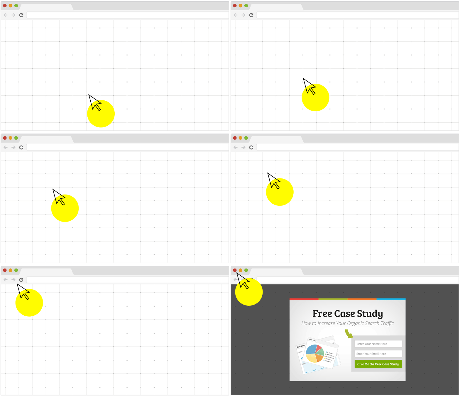
With popups, you can convert an additional 2-4% off visitors, by using a pop that is triggered when a user intends to leave the page.
One of our favourite popup tools is Optin Monster which has powerful exit-Intent technology that allows you to track the mouse movements of each visitor. When a visitors mouse cursor is detected to be exiting the page, your pop up is triggered to appear giving users a chance provide some contact details before they leave your site. This may be a limited-time coupon code or discount, a piece of free resource material such as an industry report or eBook or maybe just a call-to-action to join your newsletter list and stay informed.
Here’s an example of what it would look like:

[Image via OptinMonster]
Conclusion
So, should your e-commerce store make use of website popups?
Absolutely.
Popups can work to increase conversions and when done right, can drive conversions and develop customer relationships through your sales funnel.
Also, don’t forget to test, test, test to find the best converting popup for you. A/B test your headline, design, image, form fields, CTA button, copy and exit options. Use a website pop up builder that has a powerful, built-in A/B testing feature. Test what works best for optimal conversions for your target market, e-commerce store and offer.
Have you experimented with popups before?


