
Are your email campaigns mobile optimised? We hope so!
Did you know that 66% of all email campaigns opened are on mobile devices? That is more than half of your subscriber base!
If your emails aren’t mobile optimised and easy to read on multiple devices, you are basically throwing money out of the window and missing out on huge opportunities to engage your subscribers and drive results.
In fact, 69% of mobile users delete emails that are not optimised for mobile.
Mobile Optimisation is no longer an option, it is essential.
First things first, let’s talk about the difference between a mobile-friendly email and a responsive email.
What is a Mobile-Friendly Email? Mobile Optimised
At its core, a mobile-friendly email is easy to read regardless of what device your subscriber reads it on.
It’s defined as a single design that works well across both desktop and mobile. They generally appear the same on mobile as on desktop but are scaled down to about half the size. There is also no HTML/CSS code to adjust content and images sizes between the two platforms.
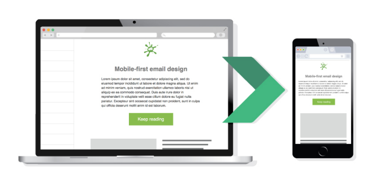
(Image via Emailonacid)
What is a Responsive Email?
As opposed to mobile-friendly emails, responsive emails rely on CSS “media queries” that change and modify your emails based on rules you set. These emails will fit any screen width and you can make changes to sizes, font, colours or content order. It ultimately creates a better reading experience on mobile.
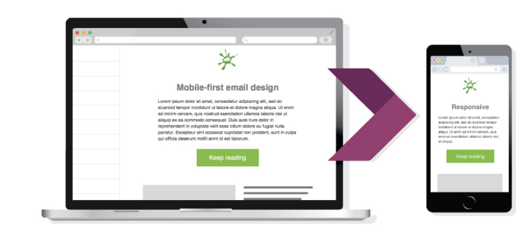
(Image via Emailonacid)
Although you might have a responsive template, it doesn’t mean that your emails are mobile-friendly.
Here are 7 hacks to improve your mobile optimisation and increase your responsiveness and engagement.
1. Shorter subject lines
Desktops typically display about 60 characters of an email subject line, while mobile devices display just 25-30 characters. Return Path analysed 2 million emails from 3,000 senders and determined that most subject lines between 41-50 characters were the most ideal length.
The length isn’t the only thing to keep in mind. You want your subscribers to open your email, to begin with, so it is important to compose an enticing subject line.
Our hot email tip is to position the offer or call to action at the beginning of the subject line to entice subscribers to open the email.
2. Don’t forget about the Pre-Header Text
This can also be referred to as preview text or snippet text (or the Johnson Box in old-scholl DM terms). It’s the text that is directly underneath the subject line that is often overlooked.
Some call it the “wingman” text to the subject line.
Make sure you don’t forget to utilise it! It is typically limited to 100 characters but it is the perfect opportunity to build upon the subject line and provide more context for your readers.
Here is a great example from Campaign Monitor:
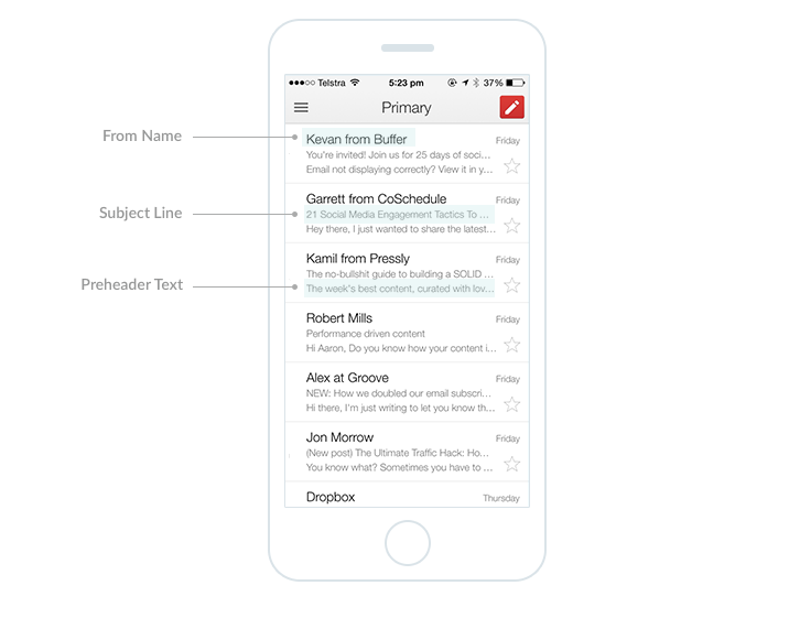
(Image via CampaignMonitor)
3. The 3-second rule
Thankfully, your subscriber has now opened your email and your next challenge is to ensure that they read it.
Nearly half of your mobile subscribers will spend three seconds or less reading your email.
That is very little time…
So, it is important that when you are writing copy for emails, you are keeping it short and concise, taking every opportunity to make it easy and digestible for your reader. This can be done by breaking up the text through bulleted lists, shorter paragraphs and scannable headlines.
Key takeaway: Make your emails short, sweet and engaging.
4. Reduce image file sizes
Mobile download speeds can increase the amount of time it takes your image to load. With that, every 1- second delay in loading time can drop conversions by 7%.
To prevent this, you can optimise your emails by displaying smaller images to reduce load time and bandwidth.
5. Your Call-To-Action
Referring to the 3-second rule, we recommend having your CTA at the beginning of your email so your readers can locate your call to action almost immediately.
To ensure clickability, keep CTA’s to 2-4 words, make your CTA buttons at least 44 x 44 pixels, choose a high contrast button colour and include 10 pixels of space around them.
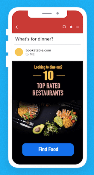
(Image via Clevertap)
6. Use a larger font size
If people have to strain their eyes to read your email, they just going to delete it.
So, make sure your user can read your email on both desktop and mobile! We recommend using at least 14pt font for body text and 22pt for headlines.
7. Single Column Layout Mobile Optimised
There is limited real estate on a mobile device compared to a desktop.
If there are multiple columns, it will appear condensed and confusing for users to navigate around.
Follow a simple one column design layout that is easily scrollable and avoids readers having to zoom in on their mobile. This will keep CTA’s in direct line of sight and draw attention to the important content.
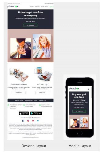
(Image via EmailMonks)
Conclusion Mobile Optimised
These steps are a starting point for optimising email for your mobile devices.
The landscape is continually evolving and there are multiple techniques to best cater to your mobile audience.
Even if your subscriber is interested in you, they may not want to spend extra time trying to figure out your message.
So make it as easy as possible for them and create mobile-friendly and responsive emails that display correctly on all devices.
One last tip, make sure that before you send out your email, you test it across multiple email clients and devices.
Go forth and optimise!
To find out how to improve your email marketing and better optimise your emails, download our inaugural 2018 Australian Email Benchmark Report. You can find the link to the report here.

